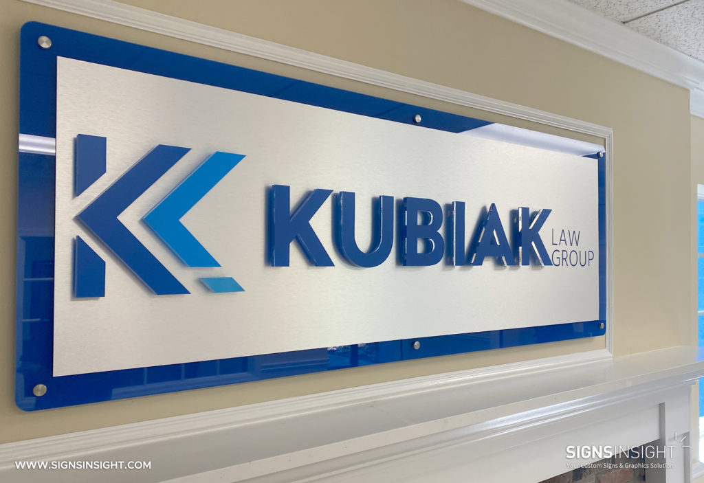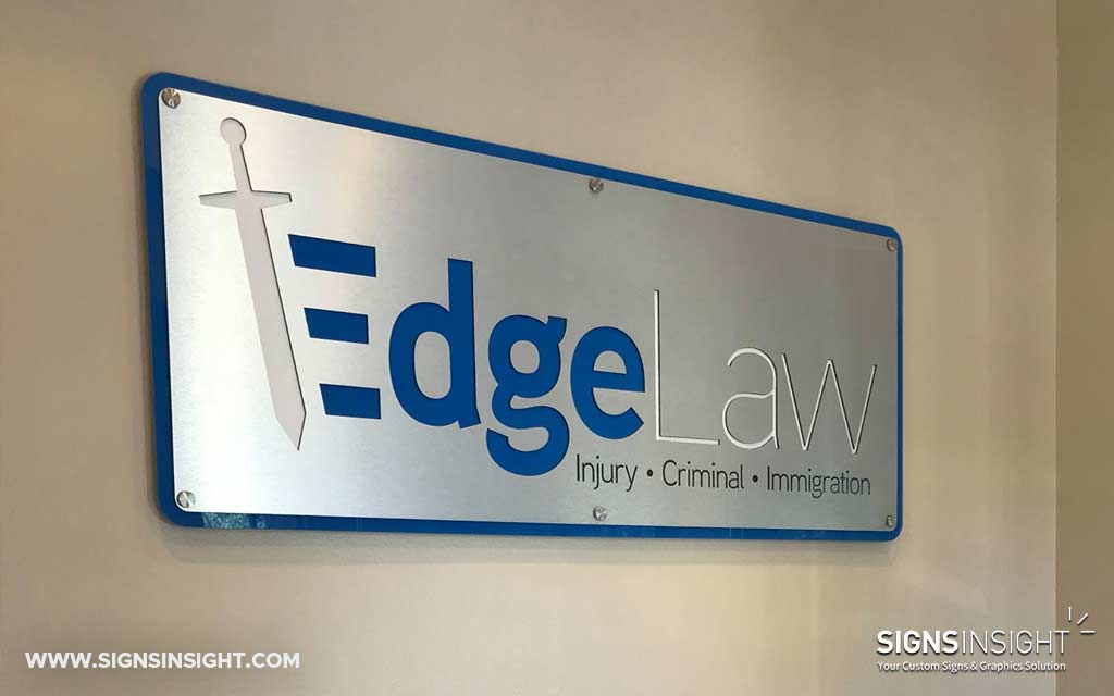
5 Factors to consider for a Business Sign for your company in the Tampa Bay Area, FL
A Business Sign contributes towards the aesthetic appeal of your storefront. But did you know that according to research, more than half of the people passing by your business or store will decide whether to enter it or not merely by judging how it looks from the outside? This alone is an important reason to invest in a professional Business Sign. However, you might be wondering how to make a business sign? Luckily at Signs Insights, we’ll take care of that process for you. Nevertheless, it will be interesting for you to learn about the different factors to consider, to make sure what is right for your business.
1. The sign type of your Business Sign
The first factor to consider is which sign type is right for your business. If your business is located in a business park or shopping plaza, chances are that your landlord has a sign criteria. This means that the sign type of your Business Sign is stipulated by your landlords’ sign criteria. If there is no sign criteria in place, you have more flexibility. The main factors to consider are if you want the sign to be illuminated or not and which materials you would like to use.
2. Choose the right location
Choosing the right location for your Business Sign is a significant factor related to the success of your sign. In order to choose the right location it’s important to determine if you would like to attract foot traffic or drive by traffic. Take a moment to evaluate your business from different directions in order to find out which location provides the best exposure.
3. Size of the sign
Although in most cases, the bigger the sign the better, this is not always true. When determining the size of your sign, keep in mind if people will see your sign from near or far. Furthermore, the size of the sign is often stipulated by your local municipality that determines a minimum and maximum sign area.
4. Easy to read fonts
If nobody can read your sign, that defeats the entire purpose of your sign. Therefore we always recommend easy to read fonts for your Business Sign. Although the objective is to keep your branding consistent, don’t be afraid to step away from that in order to improve the readability of your sign. At Signs Insights our graphic designers have the experience in sign design to guide you in the right direction.
5. Sign colors & contrast
Last but not least is the color of your sign and especially contrasting colors. It’s better to avoid certain color combinations that are difficult on the eyes, to maintain the best visibility. As a general rule, dark lettering on a light background always works best. Next time you drive around town, have a look which signs attracts your attention first, which most likely follows this ruling.

Are you ready to start your next Business Sign project? Contact your local sign company, Signs Insight, in the Tampa Bay area today!
LATEST POSTS
Contact us today to find out how we can help you with your signage needs.


