Community Custom Signs in the Tampa Bay area, Florida
Tips on Making Community Signs Effective
Having community signs is an important safety feature that is required in any residential area so as to prevent common accidents and other safety concerns. However, having the correct signs put in the correct areas around the area is not the only thing that you need to worry about; you should ensure that they are effective at what they do. This means that they should serve their purpose in the best way possible otherwise it will be the same as not having any signs at all. There are a few things that will help you in making sure that the signs that are installed are efficient at what they do.
Clear and Straight to the Point
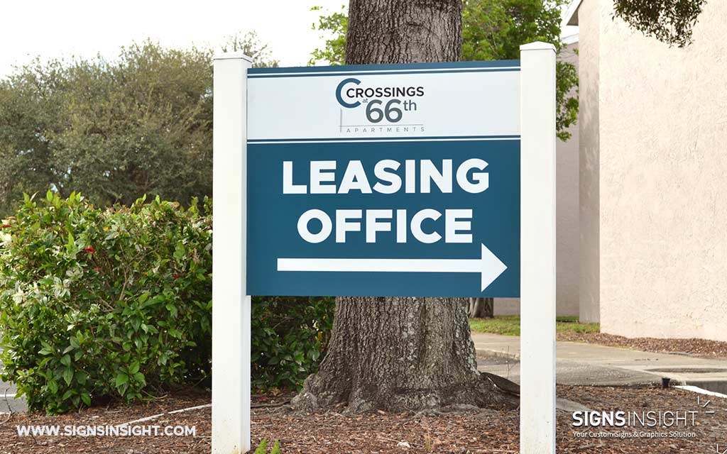
There are some signs that are very confusing to the road users or even pedestrians. This makes it difficult for them to understand what is being communicated. This is why any installed community signs, if they have words and/or directions, should be clear and go straight to the point. They should use as few words as possible so as to remain objective and make it easy for one to read it even when in a hurry. If the sign has a diagram, ensure that it is large enough and that it communicates the right message.
Should Be Placed Correctly and in a Clear Place
A common mistake that people make when installing community signs is placing them in the wrong place, so they do not communicate effectively. This can cause accidents for example in an area that one should lower their speed, then the monumental signs are not placed in the correct position to alert a driver, they may not be able to slow down on time. Also ensure that the signs are not obstructed by anything such as trees, sign boards or even buildings that may make it difficult to spot it.
Maintenance
Most community managers do not remember that signs need to be maintained and repainted once in a while. This can be a dangerous thing since once the paint has worn off, the message may not be too clear which is bad since people won’t know what is being communicated. An easy way of going about this is to have a community signs maintenance schedule so that it is not forgotten.
Use Contrasting, Bold Colors
Signs need to be seen by everyone whether or not the message is intended for them. This is why it should be attention grabbing to ensure that the person receives the message clearly. Dark colors are not suitable for any type of signs since many people may not notice them.
Signs are there to protect people and to do that; they need to be in a perfect state and should also be easily understood. This will prevent whatever the monumental signs are trying to alert people about especially if they are road signs. Pay special attention to the location and even try passing at the place to see if you are able to see it if you aren’t, then most people would probably not see it either.
Contact us at Signs Insight for a free consultation on your community signs: 813-523-3128


